Here at The Brighton Bathroom Company we love to create a splash when it comes to designing a new bathroom with our clients. One brilliant way to do this is to inject a shot of colour into your scheme, creating a really contemporary look and gives a vibrant edge to your bathroom.
So where to put your chosen hue? We find it’s either go all out with a large expanse of a darker colour or use a lighter touch, highlighting with something bright. Some great examples from our portfolio are both blue (very on trend right now); the glamorous boudoir painted in Farrow & Ball’s Hague Blue and the eye-catching, also Hove-based main bathroom with it’s victorian blue tiles. In this latter bathroom, the freestanding bath has also been finished in a complementary blue which really adds impact to the statement look alongside the black and white geometric floor tiles. This look can be recreated in greens, reds, oranges, purples for instance … the sky is the limit. We like our clients to dream without restrictions! Here at The Brighton Bathroom Company we will go a long way to source exactly what you are after.

Here are some more tips on adding colour:
We encourage our clients not to think about bathrooms as simply a place to wash but more as a room in your house where you can relax and spend a bit of time. A great way to soften the look of a bathroom is through including furniture – if you have the space – such as a window seat or comfortable chair, which of course can be painted or upholstered in a bright pop of colour.
Corian worktops in a bold colour like fuchsia or even a neon look fab and you could also consider a splashback behind the basin area in coloured glass which we’ve installed in lime recently in a bathroom in Withdean, Brighton. Our initial designs for this client included a range of options – we looked at using red or orange – both of which offset the american walnut veneer of the cabinetry really beautifully.

L-R: Corian, coloured glass splashbacks, selecting colours
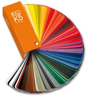
Shower trays (and basins) can now be ordered in a marble/mineral solid cast material in any RAL colour. The RAL colour scheme is used across the industry to define standard colours for varnish, powder coating and plastics. This really allows you to work across the rainbow to achieve a really unique look in your bathroom – one the neighbours are very unlikely to have!

Above: the RAL chart
A popular look with lots of clients recently has been to pick out bath and shower recesses in a different tile or material to highlight the area alongside some LED downlighters. One of our most popular images on our Instagram feed has been a bathroom in Brighton with green rustic metro tiles, where the recesses are tiled in Demosaica Moroccan mosaic zelliges – this look is stunning and contrasts really well with the plainer context of the whole bathroom.

Another client in Hove has opted for aubergine purple back-painted glass behind his two recesses. These plainer shelves look very pretty with a lit candle and your favourite products on show.
The final tip for is to consider heated towel rails. There are a few companies we now work with to supply these cool looking rads which again you can order in any RAL colour. We’ve just installed an orange heated radiator from Bisque into a home in Burgess Hill which matches the splashback and recess in hot orange – the result is one sizzlingly cool bathroom.

